

Copycats media
Blog
We like to talk, like a lot. Sometimes we write about things that are important to our customers. And sometimes, well we just write things because we don’t know what else to do with ourselves.
WTF Is That? RBG vs CMYK Artwork
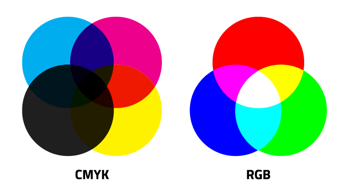
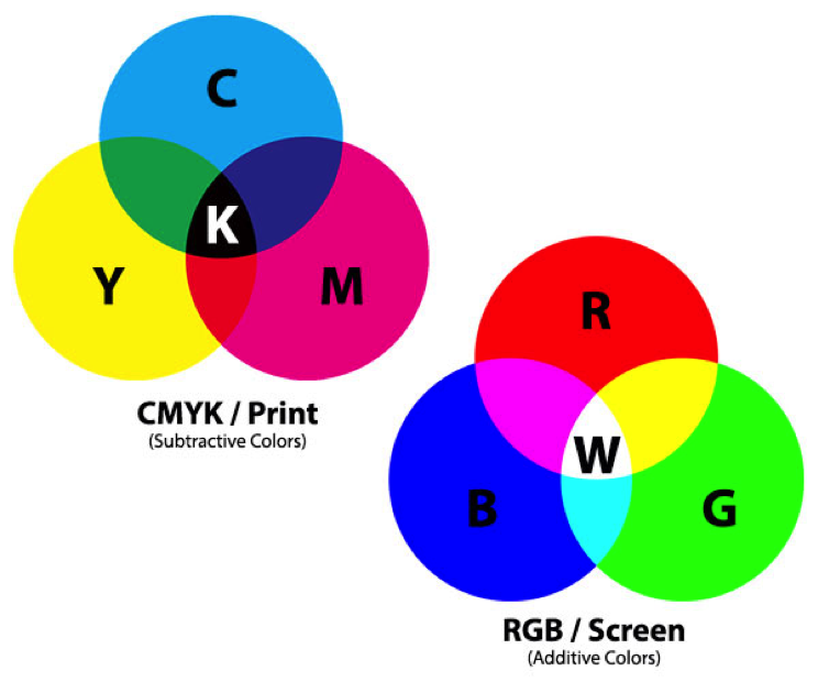
When submitting artwork for a project, we get a lot of questions regarding color quality. So we thought it would be good idea to break down the difference between RGB (red, green and blue), or the primary colors of light, and CMYK (cyan, magenta, yellow and black), or the primary colors of pigment.
When you design for print you have to keep in mind that certain colors you see on screen aren’t available to be printed in standard inks. All screen graphics displayed on your monitor, by default, are the RGB color scheme because light is displayed through your screen, allowing a fuller range of color.
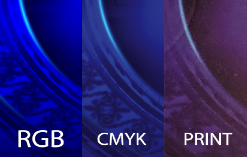
As you create your artwork and use various effects, you’ll see that switching from RGB to CMYK color mode will lock you out of various functions inside photoshop. Also, layer effects display differently once you switch over. Sometimes the change from RGB to CMYK is hardly noticeable, but there are cases where colors can shift drastically from what you see on screen and what actually gets printed.
If you’re going to convert RGB artwork to CMYK, it’s a good idea to flatten your art beforehand then make the conversion to CMYK. Many layer effects and opacities will look different depending on how you convert your artwork. After you convert to CMYK, we also recommend to color-correct your conversion by toggling the saturation sliders, rebalancing your levels, and comparing the before and after versions to have your darks stay dark and your colors stay colorful.
Do you have additional questions about submitting artwork for your upcoming project? Hit us up!
For additional industry information including tips and tricks, be sure to subscribe to our blog!